If you sat down to use a computer circa 1991, you’d find yourself working with a machine whose computing resources comprised a fraction of the power that’s now packed into your smartphone. You’d also find yourself working with an interface much less elegant than the one on your phone.
We no longer have to type arcane commands into a terminal just to open a text file. In fact, most consumers would have no idea how to do that even if they wanted to. Yet today, if you’re an engineer or an admin, there’s a good chance that the software interface you sit down to every day isn’t all that different from the one you’d have used in the 1990s.
You might be using a simple command-line interface (CLI). If you’re lucky enough to have a graphical user interface (GUI), it’s probably not especially elegant or user-friendly.
This begs the question: If computing hardware has come so far over the past several decades, and interfaces for consumers at large have also advanced hugely, why are IT professionals still stuck with age-old user experience and design in enterprise applications? Why don’t more of them enjoy sophisticated, efficient interfaces and user experiences?
That’s what I’d like to discuss here, with a special focus on user experience (UX) for networking software.
Interface inequality: Consumers vs. IT pros
It’s self-evident that UX for consumer software—like smartphone apps and desktop productivity software—has advanced enormously in the last four decades. We’ve gone from clunky CLIs to basic point-and-click GUIs to today’s touch-enabled, GPU-accelerated environments.
This evolution is no accident. It’s the result of the outsize role that consumerization is playing in driving IT innovation. To succeed in IT, you now have to give consumers an excellent all-around experience. An app that performs its core mission well, yet suffers from poor UX, isn’t enough.
That’s one key takeaway from the recently released Design in Tech Report, which shows that consumers are six times more likely to buy a product when it delivers a positive emotional experience through excellent UX.

The report also highlights how companies are investing more than ever in UX, with venture capital firms having hired more designers in the past two years than they did during the previous four years combined.
Tx Zhuo of Venture Partners confirms this new trend, writing, “Enterprise software is in the midst of a revolution” regarding UX. And the revolution will only continue “as developers move away from a purely utilitarian approach to creating software that’s more intuitive, more user-friendly and able to cater to users’ changing needs.”
And as Forbes notes, “User satisfaction, user productivity, process efficiency and collaboration, business agility and access to critical business information are the top five areas that organizations anticipate the consumerization of IT will have a net positive impact over the next 12 – 18 months.”
Interfaces and admins
So if software companies and the VC firms that back them are now investing so heavily in UX talent, why are networking professionals still stuck with archaic interfaces?
If you work in networking, you may think consumer-driven UX improvements are outside your realm. You don’t expect a beautiful interface, since IT pros are used to CLIs or outdated Web-based frontends. That’s just the way things have always been, and always will be, right?
And let’s face it, there’s a group of us, maybe a bigger group than we care to admit, who are a little proud of using a terminal. The fact that not everyone can use it is exactly the point.
But is that pride worth being left out of the design revolution? Why should you have to use an interface that looks like this?
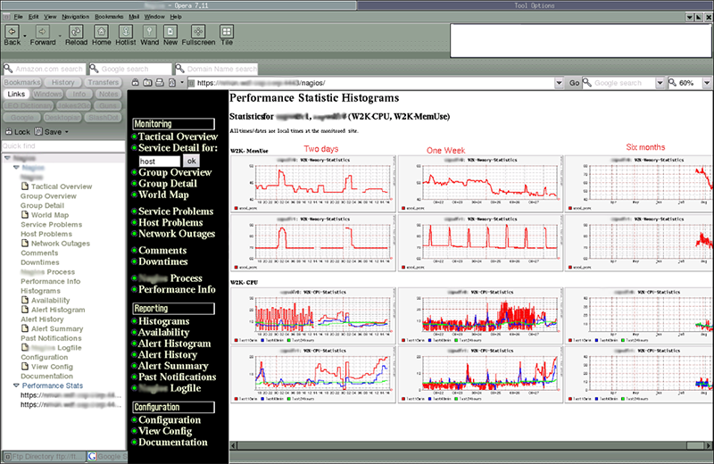
Or this?
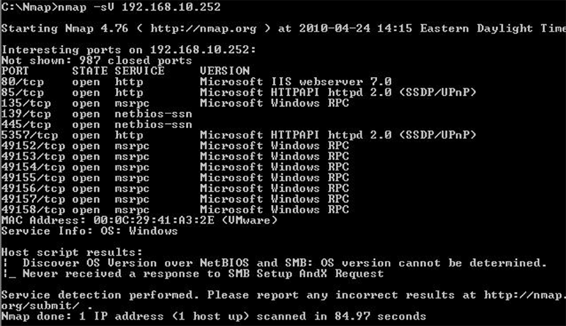
I’m not the only one espousing these thoughts, by the way. Signs that it’s high time for networking apps to join the UX revolution are abundant on Twitter, too, where users write things like:
Maybe network vendors will one day discover that books on UI/UX exist.
— Matt Oswalt (@Mierdin) April 19, 2016
When will IT vendors apply “User Experience Design” to product management. Why ? Make it easy to understand will help in purchase decisions.
— EtherealMind (@etherealmind) September 29, 2015
Doesn’t UX just mean more eye candy?
When you hear “beautiful interfaces,” you might think of screens that are flashy eye candy, but not very efficient for getting work done.
It’s certainly true that the prettiest interface isn’t necessarily the best one, and that sometimes, CLI tools are the best means of doing work. But great design actually improves the usability of software and the productivity of the user. You can have an interface that’s beautiful and elegant yet also works efficiently.
And while the CLI might be the best tool for certain workloads, chances are that if you’re working from the CLI constantly, it’s because you’re busy completing tasks that could be easily automated.
The way of the future is clear—and beautiful. It’s time networking professionals have access to products that deliver the same quality of experience that consumers enjoy.
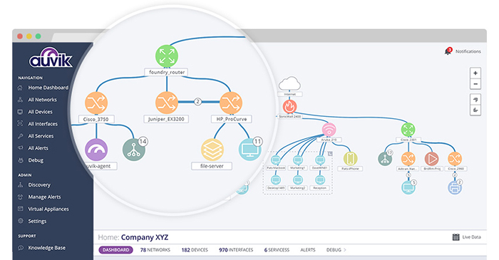




Are the charting and icons you used for the interface made in-house or from elsewhere? It looks like a mix of D3js, Bootstrap and some custom in-house stuff, very clean and minimal looking, I like it!
Please let me know your inspiration for the interface design (libraries, vendors, etc)
Thanks.
Our charts are indeed based off D3 and we use Bootstrap as our foundation — good eye! Our icons tend to draw from established conventions for indicating device types, such as arrows pointing in four directions for routers or forked lines for a load balancer, and are then adapted to our style.
Inspiration-wise, we try to stick with a flat, minimal design and ensure the focus is put on the data our users need. We try to put a lot of thought into every design and usability aspect at Auvik to ensure our users can get things done as quickly and efficiently as possible. Thanks for the feedback!
While a device-based topology map is of great value, it would be even better if this could be completed with an application/TCP-based topology map – even if just based on Netflow data pushed out from network devices and/or Network Packet Brokers.